Posted in Uncategorized

Man Up

Recently I have been spending a lot of my free time in Pieta house. I have been working with and learning about mental illness and though it is a bleak topic to base a project on, I have an abundance of interest in the issue and I wanted to explore the statistics surrounding male suicides in Ireland. I wanted to incorporate the arts module I am taking as part of my DHIT studies, Economics, and focus on how economical repercussions are affecting these tragic deaths. Over the last decade, there has been an increase in the amount of suicides in Ireland with male suicides making up 83% of the total suicides in 2011 when compared with females. I wanted to examine the rates of suicides in Ireland and answer questions concerning the dramatic difference between the suicide rate of the sexes. I hope to highlight, using visualization tools, how social and economical problems are giving rise to male suicides and explore this crisis of masculinity.

I created an interactive doughnut chart conveying the percentage of suicides that were Male in Ireland dating from the year 2000 to the year 2011. I used the Central Statistics Office to gather the relevant data-sets, allowing me to see the concerning contrast between the figures. I used http://datamatic.io/ to create my doughnut chart. It is an online interactive visualization tool that offers both free and premium charts and it also boasts the ability to simply link my publications to my google drive.
https://cdn.datamatic.io/runtime/echarts/3.4.0_125/view/index.html#id=109669102777041011328/0B28Rrct1EKYAczg4c1FTWGFHSk0

Within age groups, male suicide rates were highest in the 45-64 age-group, while women’s were highest in the 25-44 age-group. A similar pattern arises, where male deaths from suicide account for more than a third of the overall total of suicides. In 2011, there were 554 deaths from suicide in Ireland, 59 more than in 2010 and 2 more than in 2009. The previous highest number of deaths from self-harm was in 2001 when there were 519 deaths. During the period of time from 2000 to 2011, rates were generally between 4 to 5 times higher for men than for women. Their is a sharp increase in the number of male deaths from the years 2008-2009 where numbers soared from 386 to 443 and continued to climb steadily in 2010 and 2011. I referred back to the Central Statistics Office and found a data set representing unemployment rates in men from the years 2003 to 2014 and found they more than doubled from 2008-2009. I used http://datamatic.io/ to create two interactive line charts to illustrate and compare the time frames of both data-sets.
https://cdn.datamatic.io/runtime/echarts/3.4.0_125/view/index.html#id=109669102777041011328/0B28Rrct1EKYAWFJST1hiQTJqVlk
https://cdn.datamatic.io/runtime/echarts/3.4.0_125/view/index.html#id=109669102777041011328/0B28Rrct1EKYAQWd5allKSVk1b1U

There is a large increase in both data-sets during this period, indicating a direct correlation between the two.

So why is suicide a particularly male problem in Ireland? What has changed in the last decade that male suicides are rising? As we have illustrated above, unemployment rates.
The ability to work and to provide for your family is central to the idea of ‘being a man’, particularly for working class men. Suicidal behavior often stems from a means of regaining control and when the economic crisis hit Ireland hard in 2008 and unemployment rates soared, men’s control and therefore masculinity was threatened. As we have seen, the unemployment rate for men was relatively stable over the period 2003 to 2007 staying at around 5%, before increasing in 2008 to 6.7% and ascending sharply to 15.3% in 2009. The economic crisis and stress of losing your job could be a factor in the sudden rising number of male deaths by suicide in 2009. The recession saw a lot of predominantly male types of employment, such as manufacturing and construction suffer from serious decline. Therefore the unemployment rates for men were higher than those for women. I read a book in UCC library (Understanding Inequalities: Stratification and Difference By: Lucinda Platt 2011) that had evidence to support that unemployment has a direct causal effect on suicide. Studies have reported a positive and statistically significant association between unemployment and suicide, higher unemployment rates tend to be associated with higher suicide rates.
Why is employment status so important to men?
The higher rate of male suicides in comparison to females is known as the “gender paradox of suicidal behavior”. Each week we have, on average, ten suicides in this nation and eight of them are men. Men are constricted by this unrealistic notion of masculinity. This masculinity, the way men are brought up to behave and the roles, attributes and behaviors that society expects of them , contributes to suicide in men. Men who are unemployed or experiencing financial difficulties may be at greater risk of suicidal behaviors, and the numbers above speak for themselves. Despite our ever evolving roles in society, working class men still consider providing for the family as most important. This loss of control throughout the economic crisis, in a society that perceives men as the ‘bread winners’ makes men vulnerable to feelings of shame and defeat.
I found another data-set on the CSO ‘Deaths by suicide by age-group and sex, 2007 – 2011’ and I found that the age brackets in male suicides with the highest numbers were 25-44 and 45-64. I used https://www.canva.com/graphs/bar-graphs/ to make five separate bar charts (from the years 2007 – 2011) to illustrate and compare this data. The bar charts speak for themselves where the numbers of men from the ages of 25-64 dying from suicide significantly remain the highest throughout each year/chart.

 
Why was the suicide rate among men highest for men in the age bracket of 45-64 in 2011?
Middle aged men have become the age group at highest risk, particularly those who are socio-economically disadvantaged. Throughout a man’s upbringing , being ‘manly’ is emphasized and social and emotional skills are not exercised. The highest rate of suicide in women was between 25-44 (almost 7 per 100’000). Women tend to maintain close same-sex relationships across their lives whereas men’s peer relationships drop away after the age of 30. Problems with relationships and employment during mid-life are experienced intensely, because they come at a time when the consequences of long-term decisions about work and relationships come to and the opportunities to change these areas of their life are not as limitless. One further reasoning for a high suicide rate at this age, I found in a report by the Samaritans.
“Since the 1970s, several social changes have impacted on personal lives, including rising female employment, increased partnering and de-partnering and solo-living. As a result, men in mid-life are increasingly likely to be living on their own, with little or no experience of coping emotionally or seeking help on their own, and few supportive relationships to fall back on.”
Conclusion:
With the use of multiple visualization tools I strive to portray how the rate of male suicides in Ireland is inextricably intertwined with the rate of employment/standard of living. I had to be careful choosing how to present my data and play around with different types of charts and different online data visualization tools. The loss of jobs had a direct influence on suicides in Ireland. The argument I hoped to highlight was that a vast amount of suicide’s immediate and long term causes lie in socio-economic factors. After researching the relevant data-sets I was surprised at what a large increase there was in male suicides as the levels of employment/income depleted. Governments need to tackle socio-economic deprivation and the inequalities that come with it and unemployment. The government needs to address the root causes of the vulnerabilities of men that come from lower socio-economic groups by adopting progressive social and economic policies. It is clear from the data-sets that we need to target rural Ireland where the majority of suicides are happening, where the majority of jobs are in areas such as construction and agriculture and where the lack of services is most pronounced. Their low socio-economic position makes them more vulnerable to being unable to meet the demands of the masculine worker and parent roles in the mid-life stage. Before I started this data journalism project I hadn’t realized just how severe male suicide was. I am well aware that as a whole suicide in Ireland is an extensive issue but I was unaware of just how much higher the rates of male suicides were in comparison to women’s. In Irish fashion as a nation of talkers we are strangely quiet about this epidemic. It needs to be a national conversation, free of stigma. It’s time we man up and open up.

References:


Posted in Uncategorized

The Whole Zooniverse In My Hands

‘The Zooniverse is a collection of web-based citizen science projects that use the efforts of volunteers to help researchers deal with the flood of data that confronts them.’ I enjoyed this assignment as I love seeing the internet come together to overcome obstacles and I enjoy feeling like I contributed to something and feeling part of an online community. Zooniverse allows public access to a range of projects to assist researchers with an otherwise unmanageable flood of data. It reaches to a large audience and finds individuals that are willing to devote their free time to projects that can add to scientists/researchers and in turn our own knowledge of the world and beyond in the case of ‘Hubble’s Hot Stars’.
I set up my own profile on Zooniverse by creating a username and giving my email address. There was different projects all put under a broad range of categories such as climate, nature, literature, language etc. I chose to discuss the Chimp & See project which was under the ‘nature’ category. I studied the Quipi project in my first year of DH and loved the idea of watching technology make a positive influence on the world around me, and in both cases the projects gave access to parts of the world I have never seen before- in this case Africa. It also helped that I am an animal lover with a keen interest in animal conservation. I noticed after I played around with the project that it was my username that was associated with the contributions i made.
The project is vibrant, easy to navigate and fun to use. It is based around the life of chimpanzees and lets you explore and study animals in their natural habitats through pictures and videos. After I clicked into it there was a tutorial explaining how to navigate the project which is so important to have if you want people to feel comfortable enough to contribute. After watching this 9 pictures popped up of different natural habitats each time with the option to click either ‘I see something’ or ‘Nothing Here’, the latter moves on to show you another array of pictures. If you click on ‘I see something’ up comes a video and you are asked a series of four questions. The first time I saw an animal I had to identify the species. They give you a list of species to chose from with a picture attached to each. They ask you the age, sex and the activity your species is carrying out. They have an option for unidentifiable for the sex of the species and a long list of activities such as camera reaction/feeding/social interaction/playing. On the left is a field guide that explains each species, with helpful ways to identify the sex, behavioral explanations and images. I found it most helpful in identifying different animals as they go into clear detail, for example when I found a chimpanzee I clicked on the field guide and up came the description ‘This large primate, a close relative of humans, has no tail and is usually seen on the ground. The hair is most often black, though it can appear grey or yellow-grey, especially on the lower back. The face, ears, palms, and soles are hairless and skin color varies from peachy-pink to black. They most often travel by knuckle-walking on all fours, and are occasionally seen in trees. Males are slightly larger than females; infants have a white spot on rear. Almost always seen during the day.’ On the right is a favorite button so you can save your favorite videos and images. I discovered you can also use this favorite tool to collect videos or put them in specialized collections that you can set up with the “Collect” button in the video frame on Talk or you can use it as a tag group collection using the ‘Create a tag group’ option. You can share all your findings on Twitter, Facebook and Pinterest. You are shown your location on a map after completing identification. I discovered a human in Sierra Leone and a chimp in Guinea. There is also chimp ID boards that allow you to ID tag/name the chimp that you find. I found out in the FAQ’s section that the site name identifies at which location in Africa the videos were taken. The name is a combination of two random words, plus a number. The number signifies the order in which each site’s videos were uploaded onto the project. I clicked on the ‘Discuss on Talk’ button which brought me to my video’s talk page. I had the option of adding a comment, a question, or a hashtag. There was an option to start discussions about my video in the Help and Chat sections. I thought it was cool being able to discuss my thoughts with other people I loved seeing their thoughts on the videos. You can also add more than one annotation to a video, I saw two small antelopes eating and I used the quantity selector to select the number of animals I saw. I also looked in the FAQ’s to see what I would do if they had been different species, or more than one of the same species doing different things and was told you should add multiple annotations to the video. I found the site so informative and easy to understand, it provided loads of helpful tips and made the project so much fun to use.

The Zooniverse and the projects it contains is produced, maintained and developed by the Citizen Science Alliance (CSA). One thing that did make me anxious was the implications of my contributions, what if I was wrong? What if I had labelled an animal incorrectly? I did some digging and found that the CSA modify the data before redistributing it and using it to help further scientific research. I was not concerned with what the CSA did with the data I inputted as the goal of the whole project is to collect information for researchers to use and I could not see how my input could be used in a negative, harmful way. I trusted them to do the right thing with my data. Zooniverse said itself that ‘The member institutions of the CSA work with many academic and other partners around the world to produce projects that use the efforts and ability of volunteers to help scientists and researchers deal with the flood of data that confronts them.’ I felt a sense of community in contributing to this project and enjoyed how interactive it was. This project is a brilliant example of the positive side to public access.
I learned that there were four chimpanzee subspecies. The more I played around with the project the better I became at identifying species and knowing how to identify them. I spotted two humans and it started me thinking about not only our influence on the animal kingdom but on technology’s influence on the animal kingdom, the positives for a change. I noticed a trend in discussion topics about how chimpanzee behavior can tell us more about the origins of humanity and evolution. I study human behavior a lot in economics and I love seeing how our smallest habits and behaviors can tell us so much. Studying the behavior of these animals and having access to them can improve our understanding of the evolution of humans and their cognitive and cultural abilities. DH once again proved to me just how broad our online world is and the power it has. I love being given the opportunity to discover and explore these websites and projects and seeing how impressive they are.
This project was my favorite to use and I thought the field guide was a particularly useful tool that quickly described everything the user needed to know to correctly input data. I think that in future projects both in DH and in the future it has shown me the importance of the smallest tools and how they can go a long way. I think including the ability to share your findings on social media is clever in that it allows the project to be seen by a larger audience which is vital in this kind of crowd sourced initiative. Zooniverse is so far the most fun tool I have been introduced to yet, I loved the variety it provided and it is something I intend on using in the future.

Reference:

https://www.chimpandsee.org/#/classify

https://www.zooniverse.org/projects?discipline=nature&page=1&status=live


Posted in Uncategorized

You Never Know What Goes On Behind Closed… Social Media Accounts

Scrolling through my DH twitter account one day I came across this tweet:

I began to think of my online connections, how many people I actually know and how many peoples online profiles I have access to. Furthermore just how accurate are these (and my own) online profiles?

I currently have two twitter accounts, a Snapchat account, a Facebook and an Instagram profile; all of which I am active on daily. Totaling my two twitter accounts I have 1’546 followers, 265 Snapchat friends, 1’466 friends on Facebook and 1’635 Instagram followers. This is a grand total of 4’912 people that have access to my daily life. Considering I have each profile marked ‘private’ this number forced me to consider what online privacy really means.  I interact with aprox 25-30 people (from housemates, to lecturers, to people in my course) during an average college day. This number is significantly increased when I go to work and serve customers in one of the busiest nightclubs in Cork City. However this still doesn’t account for the number of people I consider ‘friends’ online.

I decided to look into what the actual definition of a ‘friend’ is.

  1. a person with whom one has a bond of mutual affection, typically one exclusive of sexual or family relations.
What I was most interested in however was that the definition of the word friend now included a verb as well as a noun, incorporating the social media aspect of modern friendship.
verb
  1. informal
    add (someone) to a list of friends or contacts on a social networking website.
    “I am friended by 29 people who I have not friended back”
I began scrolling through my online profiles determining how many of these people I had a ‘bond of mutual affection’ with. Not surprisingly I had not seen some of these people in years, some I only knew from their social media presence and a handful I didn’t know at all. Social media boasts the advantage of keeping people connected, I can access Beyonce’s Instagram or Donald Trumps twitter at the touch of a button, in a matter of seconds. I started to see how many people I actually knew and how many I had an idea of from their online presence. I realized how often me and friends would use the phrase ‘Oh I know her from twitter’ or ‘Oh I follow her on Instagram but I’ve never met her’ so I decided to run a poll on twitter to see how many people judge a person based on their online existence. Here are the results.

 poll-twitter

Which got me thinking about the person I am online compared to IRL. The notion of privacy in social media is-in my opinion- a double edged sword. On one hand, you overshare private information to a large social circle including practical strangers, but on the other hand how much of the person you appear to be on social media is actually you? Are we just keeping up with appearances? A quick scroll through my Instagram feed and I know that the person I appear to be is not always a true reflection of myself in real life. I have shared pretty, filtered pictures with a smile captioned with happy sentences on days I am stressed, sad, make up free with my hair on top of my head. However my ‘friends’ in that moment see me as happy and carefree. Social media adds a whole new meaning to the phrase ‘you don’t know what goes on behind closed doors’. You can choose what you want people to see, edit out the bad bits, creating an ideal-but fake- version of yourself. You can have 240 ‘hearts’ on your picture and still feel like the loneliest person in the world. With the click of a button you can decide how to present yourself, which gives you a lot of control over how YOU are seen but significantly less control over ever really knowing the people we are connected to on social media-the people we interact with everyday.
References: 
Posted in Uncategorized

Photogrammer

Since I have started studying Digital Humanities I have been introduced to many interesting DH projects such as the QUIPU project (my favorite so far), Open Source Mapping and many others.  Today I discovered a new project that incorporates a vast amount of historical information on an interactive map in pictures. Digital Media is so wonderfully extensive that it can provide problems when figuring out how to archive it all. I loved this project as soon as I first used it. I always admire how DH takes massive amounts of information and cleverly incorporates it into an interesting and educational project. It would certainly make secondary school history more fun for students if this was used in a classroom.

The U.S. Farm Security Administration and Office of War Information photo archive consists of roughly 170,000 photographs documenting American life from 1935 to 1944. This archive features some of the most iconic photographs of Americans taken during the Great Depression and World War II.

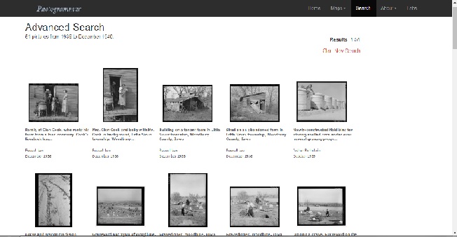
The project is a clever, creative means of organizing an enormous archive in a clear, explorable fashion. It is accessible to scholars and the public and I was not shy to start playing around with it. I have inserted some pictures below;

map

map2MAP3.jpg

I think this interactive map is a stunning example of how to better organize, search, and visualize the contents of any large archive. The project itself seemed to incorporate every area of my course, from digital media to computer science, to of course Digital Humanities itself. Photogrammar’s interactive map plots about 90,000 photographs from the archive onto a map of the United States.  When I started exploring the tool and playing around with it I discovered I could search through specific  photographers work and it shows me where they visited. The photographs included in this project are incredible in their ability to capture American history.

They project seems to still be growing and developing. There is a Metadata Dashboard still in development that I look forward to using when it is complete. The site boasts the abilities of this tool describing an

Interactive dashboard showing the relationship between date, county, photographer, and subject in photographs from individual states.

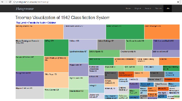
I also explored a Treemap which visualizes the classification system designed by Paul Vanderbilt in 1942. I clicked on the heading ‘People As Such’ which included 12’241 pictures. 7’018 of ‘Groups and Individuals’ and 5’223 under ‘Children’. I clicked into children and several sub headings popped up:

map4

I clicked on children at play and I have included one of my favorite pictures I found below

MAP5.jpg

I loved exploring this Digital Humanities tool. I have quite an interest in Irish history and would love to someday be part of a project like this for my own country. I strongly recommend exploring this interactive map as it covers a broad range of interests from photography to history to computer science and the humanities. Just another project reminding me why I love being a Digital Humanities student!

I recently read a blog post about interactive learning and it’s effects and I feel it ties in with this review on an interactive tool! It was interesting to learn about the benefits f this method of learning after exploring Photogrammer! Here is the link to the blog post!

http://aislingkilcawley.com/learning/is-learning-with-interactivity-the-best-way-to-learn/#comment-2

References: 

http://photogrammar.yale.edu/

Posted in Uncategorized

Technology and Trump

I recently wrote a blog discussing social media vs. online persona’s and in light of current events I began thinking of technology and self promotion. How you can use the improved picture you painted of yourself (that I described in my last blog) to further heighten your career.  In this post I wanted to analyse how Donald Trump – as a candidate for presidency- used social media as a tool to gain support. I remember studying propaganda in History- techniques used to paint Hitler in a positive light. I remember reading how they worked and how successful the use of bias was. Well now it’s a whole new political ball game. Social media has allowed for a shift in the dynamic in the relationship between politicians and voters. First it was newspapers, then radio, then television and now social media. Throughout history, advances in mass media technology have played a vital role in presidential elections, shaping how voters view the candidates and the issues. Now leaders can conveniently self promote themselves to millions of people across the world instantly, and just like before, it works.

Social media was more important in this campaign than ever before. According to experts, in 2016 the force of social media took the throne in communications for campaigning. Trump made social media the pillar of his campaign. Here is a list of his social media following (to date):

  • Facebook –  16.2 million likes
  • Twitter –  followed by over 17.2 million accounts
  • Instagram – Trump’s followers amounting to at 4.3 million.
  • YouTube – Trump’s YouTube videos have a little over 9 million views

Trumps most successful social media platform during his campaign was undeniably his controversial, attention grabbing twitter account. While a scroll through Clinton’s account appeared carefully scripted and filtered, Trumps was brutally and often controversially authentic. It was obvious he personally was behind his own tweets which painted him in a more credible, trustworthy light to his supporters. While Hilary’s strategy was to be present everywhere, (she used more social media platforms than Trump) Trump being Trump, mastered the method of having more attention grabbing content to gain followers on social media. While scrolling though his tweets (with difficulty) I noticed how he used the phrase ‘crooked Hilary’ several times over and over, which was a clever tactic of communicating a prejudiced image of Hilary that was so shrewdly simple it would stick.

According to the Pew Research Center 24 percent of American adults said they had

“turned to the social media posts of Donald Trump or Hillary Clinton for news and information about the election.”

Compared to 15 percent who reported they got information from the candidates’ websites or emails.

Trump cleverly used social media as a pulpit to have a real time speech to millions of people whenever he wanted- all in 140 characters or less. While I may not personally support (or can’t stand) Trump and what he stands for, he effectively and efficiently used social media to have his supporters eating out of the palm of his hand. I think the presidential campaign plainly portrays the power of social media in communicating with people. It conveyed a distinct difference this year when compared to past elections, and boasts the ever growing influence of social media on our lives. In my eyes, anything that can give a man like that access to nuclear codes, is pretty impressive.


Here is a link to a blog post done on the influence of social media in the repeal the eighth campaign. Laoise is also studying DH and I enjoyed her outlook on the link between social media and current affairs.

http://laoisebyrnering.com/digital-evolution/is-facebook-impacting-repealthe8th/#comment-11


References:

http://www.journalism.org/2016/07/18/candidates-differ-in-their-use-of-social-media-to-connect-with-the-public/

https://www.thecampaignworkshop.com/presidential-social-media-campaign-strategy


Posted in Uncategorized

Print – Alive, Endangered, Extinct?

We hear about animals becoming extinct and being endangered so much that it unfortunately has lost its shock factor.Great efforts go into saving these animals by nature conservation parks, animal lovers and the like. Which begs the question- who is fighting for the presence of print?  I recently attended a talk hosted by the UCC journalism society in the Gluckman Gallery and it got me thinking about the lifespan of print. There were three speakers, one fashion blogger, a young, upcoming, inspired fashion designer named Shannon Haly and Marguerite Kiely, the Art Director of RSVP magazine. Ms Kiely’s talk really tied in with the much debated topic the endangerment of print. Over the course of my Digital Humanities studies this subject has reappeared frequently and has brought to light the pro’s and con’s of print and its place among modern technology. Ms Kiely looked to the future stating ‘I don’t know if my job will exist in ten years time’ and broached the subject of the future of magazines, newspapers and all the jobs associated in these industry’s. As a magazine with an online presence she believed that online and print could ‘be complimentary’ and ‘can work hand in hand’. She spoke of technology and how it was ‘killing our attention spans’ and I took to the internet to research the link between the two. As it turns out a recent study by Microsoft Corporation has found this digital lifestyle has made it difficult for us to stay focused, with the human attention span shortening from twelve seconds (in 2000) to eight seconds (in 2015)  in more than a decade. I found this extremely interesting seeing as the average attention span of a goldfish is nine seconds long. With this worrying side affect that comes with a growing digital presence in the world, came a positive. That our ability to multi task has significantly improved. Seeing as we have succumb to the attention span of your average household pet, I began to wonder about my own life beyond the bowl. How present is print in my own life? While I will admit that I spend much more time on social media than I do reading a book or a newspaper during my average week, I am an avid reader and prefer the idea of sitting down with a physical book than ever using an e-book. (An electronic book is a book publication made available in digital form.) In saying this I would much rather reap the benefits of online research, where the world is at your fingertips, rather than physically going searching for information in a library. Digital advancements bring convenience in a fast paced digital world and with access to so much it is no surprise that print is considered by some as becoming obsolete. Growing up in a digital revolution has made me take the internet for granted so I decided to ask my dad (who’s online presence isn’t half as extensive as mine is) about his own average week and in turn explore the generation gap and its relationship with print vs online. He told me that he could not imagine his week without getting a daily newspaper and reminded me of my young teenage years- pre Facebook- when I would run to the shop on a Saturday to buy the latest magazine to add to my collection or a new book to keep me occupied. With information and entertainment at our fingertips and a new generation of people born into a digitally advanced world, one thing is certain. Print is endangered. Which begs the question of not ‘what do we do about it?’ but ‘do we want to do anything about it?’

Huge thanks to the fabulous folks at the @UCCJournoSoc for having @miss_margey over for tea & a talk tonight. It was an absolute blast! pic.twitter.com/RGUNLJY8DW

References:

http://www.medicaldaily.com/human-attention-span-shortens-8-seconds-due-digital-technology-3-ways-stay-focused-333474

Posted in Uncategorized

TEXTUAL HUMANITIES

For my final assignment as part of my Digital Humanities studies this year I was asked to experiment with and explore some visualization tools. I had never really given much thought to the idea of data visualization in general but during the course of my studies I learned that it is simply any effort to help people understand the significance of data by placing it in a visual context. Patterns, trends and correlations that might go undetected in text-based data can be exposed and recognized easier with data visualization software. I decided to use Voyant 2.0, a tool we had discussed in class and on reflection I found the process really succeeded in giving me an appreciation of various modes of inquiry and I found it enjoyable aswell as being an easy tool to work with. The publicly available text I chose to analyses was ‘Phenomenal Woman’ by Maya Angelou. The poem itself boasts colorful language and repetition which I thought would be interesting to explore.

Here is a screenshot of my results. That muddle of text in the upper left hand corner is an engaging, colorful depiction of both the main words used throughout the poem aswell as the words that appear less frequently in smaller font. Words such as ‘Phenomenally’, ‘woman’ and ‘that’s’ are in big bold font and easy to recognize. The word woman appeared a total of eight times and the word phenomenal was reiterated four times.
While I understand that upon reading the poem without the use of the Voyant tool you can asses that the phrase Phenomenal Woman is consistently repeated I found that I noticed a few more aspects of the poem that I wouldn’t have picked apart before using this tool. It is obvious this poem is a positive message to inspire confidence in women but I found it interesting that the words, ‘I’, ‘me’, ‘I’m’ were used so frequently. It forced me to look beyond the idea that the poem was solely based on helping others, it made me realize it was about the poets self esteem and self love. Angelou was focusing on what she found made her ‘phenomenal’. It made me question whether it was simply a message or was it something she told herself so that she might believe it herself? Was this an inspiring poem or was it a self praising mantra she needed to hear?
Comparing the mentions of all these words and seeing them represented visually helps to show the importance of each single word in a poem. I enjoy picking poetry apart, finding meanings in metaphors and so on and I found this tool to be an impressive analytic environment for this digital text. It is easy to use, accessible and exremely fast. It includes options such as exporting, embedding, seeing your visuals in corpus terms aswell as counting words. It provides a more in depth way of exploring a poem. In poetry I find that is extremely important and so I tried this tool on some other poems from poets such as Plath, Heaney and Rupi Kahr and was impressed each time.
Voyant allowed me to easily glimpse behind the scenes of poetry. Its main themes, its message, its repetition in one impressive tool. I can only imagine how handy this would be for taking apart screenplays and scripts. Out of all the tools I have used I think this one would be the most beneficial for students doing the comparative in Leaving Cert. It is a handy tool to compare and contrast, to analyses and to make you think.

link to Voyant: http://voyant-tools.org/

Posted in Uncategorized

Open Source Mapping

Open Street Mapping

As part of my second assignment we undertook a project using the DH tool Open Street Maps (OSM). We either had to contribute to our own local area or to contribute to a Humanitarian cartography initiative of an unexplored area.  In my last assignment I reviewed HistoryPin as a DH tool and I enjoyed the feeling of participating in a community based project so I decided to take this as an opportunity to respond to humanitarian needed cartography initiatives. I chose to map #1554 ‘Dar es Salaam – Ramani Huria 5’ which is also described as ‘the residence of peace’. It is the largest city of Tanzania and the largest city in eastern Africa by population, as well as a regionally important economic centre. We were asked to firstly make an account on OSM which proved to be easy and fast to join, and then proceed to map three ‘tiles’ which are areas on the map. You are given access to add roads, buildings, parks, farmlands. Our last exercise was to review another OSM member’s work and to conclude whether it was legitimate.

This was my first time using a DH tool solely dedicated to mapping so initially it took some getting used to.  It required some trial and error tactics at first but I began editing using ID editor. I had a look through the map at some of the explored and edited area and I was impressed by the accuracy and the obvious effort that other members had obviously put in. I realised that I had some responsibility as it was clear people were actively contributing and that my work could affect members of the community.  So I began by mapping two industrial estates as I wanted to gain some experience before attempting to map a road or lake. As I gained confidence I decided to intricately map a road that hadn’t been inputted before. As I finished each ‘part of my puzzle’ (as I began referring to it as) I had to save it and mark it as complete. It was rewarding seeing my contribution to the community laid out so clearly for everyone to see and it was a nice feeling of engaging with this city of strangers. I had three other active members participating in putting this area on the map so to speak, and the whole mapping process took me about fifty minutes. I felt a sense of comradery with these three other members and a sort of interdependence. I felt I could depend on them to correct any mistakes I might have made out on inexperience or ignorance of the area. The whole process was relatively straight forward and easy to use once you got the hang of it.

Untitled

Like I previously said there was a feeling of responsibility to this unknown community as I was actively altering the area in which they lived. I haven’t yet been validated so I am eagerly awaiting to see if I was accurate in my contributions or if they could be improved. Seeing as I mapped a road, three buildings and three park areas I felt these changes applied to a vast amount of people. Whether it was delivery men to industrial estates, families or tourists seeking woodland or recreational areas or even emergency services having to use this map to find a route, the project had a real weight of accountability tied in with it. One implication was a personal one. I found it kind of nerve wrecking posting this in case I was wrong. I gained confidence as I progressed through it though. I kind of related to open access writing in a way as it really is about putting yourself out there and opening yourself up to making mistakes that other people can see. I also thought some of the pictures were slightly outdated. I viewed my local area just of personal interest and I noticed it was in desperate need of updating. The car in my drive was one dead giveaway we got rid of that when I was five years old! That’s fifteen years ago! A lot can change in an area in fifteen years and I think a mapping tool like this can’t afford to not be up to date, though I understand that keeping it constantly updated can be difficult and expensive.

I learned a lot from this mapping experience. I felt that looking back I was very naive thinking that not much people participated in open mapping resources but was not only was I amazed at the amount of people that used it but I was impressed by the attention to detail and diligence that some members had displayed. I gained confidence from opening myself up to any potential criticism and participating in this group based project. I think it’s a real credit to open source digital tools being able to digitally travel from the comfort of your sitting room.

I would definitely contribute to OSM more in the future as I enjoyed the challenge and the small sense of validation you feel contributing to something like this. I think using this tool to demonstrate my work in the future shows that I am putting in effort and looks impressive. There was a lot of positives to completing this project and I will definitely try to incorporate using this tool in my future studies.

Posted in Uncategorized

HistoryPin

Honestly, I hadn’t realized the vast amount and variety of digital tools available to me as a DH student. I was surprised to see Tumblr was recognized both on DiRt and on an article published by the college of arts and sciences at the University of North Carolina at Chapel Hill. I use it myself frequently as a social networking site and was tempted to review it but because I was so taken back by the amount of tools I had never known existed I decided to try something new. I decided on a digital mapping tool ‘HistoryPin’. It can be used with Google Maps and is described as ‘A digital, user-generated archive of historical photos, videos, audio recordings and personal recollections.’  Users are able to use the location and date of their content to “pin” it to Google Maps. I found exploring this Digital Tool to be extremely beneficial as the assignment itself just opened me up to so much I hadn’t known about. I feel I am constantly learning about completely unexplored topics and areas as part of my Digital Humanities studies.


I was mainly intrigued by HistoryPin as I had found Shawn Day’s use of mapping tools in lectures interesting. I liked the idea of everybody being able to contribute to it. I feel it also ties in with current affairs with the hundredth anniversary of the 1916 rising occurring this year. It seemed like an appropriate time to use this assignment to combine my DH studies and an important piece of our heritage. There is no cost to use this tool and it is compatible with laptops, phones and tablets as well as having access to Facebook, Google and Twitter. This, along with it being an enjoyable and interactive way of learning, make it appealing to students. To contribute to HistoryPin you must have a Facebook, Google or Twitter account but you do not need an account to explore all maps and data. I found the fact it was supported by Google appealing as I was already familiar with Google Maps and found it to work to my advantage. I read an article reviewing HistoryPin on Fractus Learning written by Wade Gegan describing HistoryPin as ‘a priceless resource’ used ‘to visualize snapshots of history on a fully interactive worldwide map. I found all this to really suit my research needs as a student and Mr. Gegan confirmed that by saying that ‘the Historypin community contributes hundreds of thousands of images from the past, making them freely available for students to view, research and even contribute to themselves.’ I do think that this fits my research goals as it keeps me interested, it’s easily accessible and primarily I enjoy using it. The idea of contributing to something liked this seemed much more exciting than your daily tweets, status updates etc.

HistoryPin was created to accommodate for stronger local ties and to include people of all ages and all social and technology based abilities. Over the last fifty years HistoryPin has seen these problems and wanted to eliminate them. This digital tool was born to inspire change. It connects local communities as well as opening up some historians work to a much bigger audience. Mr. Shawn Day remarked in our last lecture that people in local communities would obviously know more about a local area than an aerial photograph could tell, so by getting local communities involved it allows for more historical information to be shared by let’s say eye witnesses rather than just something out of a textbook. There is a strong community behind HistoryPin as it connects both young and old, libraries and museums, schools and archives. It was found that 38% of people that used HistoryPin became more community activists and 70% of participants formed a relationship with someone new through a HistoryPin project. It is an open source, interactive resource that combines geography, social media, history and people of all ages. I think that because it encompasses so many different subjects with a modern, interactive twist that it should be introduced in secondary schools as part of the curriculum. It is rewarding and contributing your data and results helps with a sense of achievement, confidence and social inclusion.


I found the tool easy to use and easy to explore. I was pushed down this road when choosing this tool as I wanted to find a tool that was part geo-spatial DH tool and part social media. I found an interesting article that was published recently by the RICE school of Humanities commenting on the reliability of this digital tool.  Jon Voss presented HistoryPin and while he recognized that is might not be seen as a place of hard fact and might not be relied on heavily as a scholarly tool he made some good points in favor of HistoryPin. While we know that HistoryPin may not provide solid historical information that is reliable or tailored to faculty research interests that apparently is the point. Voss explained that communities can come together around shared social history and create projects that are truly important to them. I think this is important because it includes people that have had no previous access to technology. I think the reason I enjoyed it so much is because HistoryPin is primarily oriented around a social goal, and the knowledge component is a side-effect. However researchers have worked with HistoryPin, Stanford have completed several projects involving HistoryPin (one on Japanese internment). The whole concept of HistoryPin really stirred my own personal career interests, which include using DH in accessible ways that enable and empower people and communities. Voss described his career in a single question: “am I doing right now what’s really important for the world?” I think this tool really shows how broad the concept of DH can be. That not only is there a vast amount of academic benefits to the humanities but there are (certainly with this project) plenty of other places that DH holds value. I think it’s a fantastic tool that empowers communities to build their own social histories. It has a personal element to it too and I enjoyed reading through my own interactive Irish history as well as other topics of interest such as feminism.

I can see myself using this tool in the future and even now I enjoy seeing what people are sharing and I enjoy being involved. I feel it’s a way of connecting my university life and my own personal life.


References:

http://hrc.rice.edu/sawyer-platformsofknowledge/node/32

http://digitalhumanities.unc.edu/resources/tools/

http://www.fractuslearning.com/2014/08/01/historypin/

https://www.historypin.org/en/

http://dirtdirectory.org/


<blockquote class=”twitter-tweet” data-lang=”en”><p lang=”en” dir=”ltr”><a href=”https://twitter.com/DiRTdirectory”>@DiRTdirectory</a&gt; Historypin <a href=”https://t.co/00OtqFEWFS”>https://t.co/00OtqFEWFS</a&gt; <a href=”https://twitter.com/hashtag/dhtool?src=hash”>#dhtool</a></p>&mdash; rachael (@rachaelbarry14) <a href=”https://twitter.com/rachaelbarry14/status/696699087194820608″>February 8, 2016</a></blockquote>

//platform.twitter.com/widgets.js